TECHNICAL PROJECTS
Title: Built an Amazon Retail Analytics Report with Microsoft Power BI
I have built an Amazon Retail Analytics Report using Microsoft Power BI in this
project. The report helps retailers to analyze their sales performance and customer
behavior on Amazon. I have used data from Amazon Marketplace Web Service
(MWS) to extract data related to products, orders, and customers. The report provides
insights into product sales, customer demographics, order trends, and customer
behavior, which can help retailers to make informed decisions on pricing, promotions,
and inventory management.
Responsibilities:
• Extracting data from Amazon Marketplace Web Service (MWS) using API calls
• Cleaning and transforming data using Power Query or SQL
• Building visualizations and dashboards in Microsoft Power BI
• Analyzing data to gain insights into product sales, customer behavior, and order trends.
• Creating a comprehensive report that provides actionable insights for retailers.
Conclusion:
By building an Amazon Retail Analytics Report with Microsoft Power BI, we will be able to help retailers make informed decisions that can improve their sales performance and customer satisfaction.
By building an Amazon Retail Analytics Report with Microsoft Power BI, we will be able to help retailers make informed decisions that can improve their sales performance and customer satisfaction.
Title: Project Description: Bike Sales Dashboard using Excel
The Bike Sales Dashboard is a comprehensive tool that helps businesses keep track of their bike
sales and analyze their performance. This dashboard was developed using Excel and includes a
variety of features to provide a clear and concise view of sales data.
One of the key features of the Bike Sales Dashboard is its ability to display sales data in a visually
appealing and easy-to-understand format. The dashboard includes a variety of charts and graphs
that show sales trends, top-selling products, and revenue by region. This provides businesses with a
clear picture of their performance and helps them identify areas for improvement.
Another important feature of the Bike Sales Dashboard is its ability to track sales by product and
region. This allows businesses to see which products are selling well and in which regions, helping
them make informed decisions about inventory management and marketing strategies.
The Bike Sales Dashboard is also user-friendly and easy to customize for businesses of any size.
Users can input their own sales data, adjust variables, and modify the dashboard to meet their
specific needs.
Overall, the Bike Sales Dashboard is an essential tool for businesses that want to improve their
sales performance and make data-driven decisions. Its visually appealing and user-friendly design,
comprehensive sales tracking, and customizable features make it an invaluable asset for businesses
of all sizes. By using this dashboard, businesses can gain valuable insights into their performance
and take steps to improve their bottom line.
Title: Data Professional Survey Breakdown Using Excel and Power BI
Project Description:
I have meticulously collected and cleaned the survey data using Excel and visualized the results using Tableau. Now, I invite you to explore the key insights and trends in the data profession through this unique opportunity.
I have meticulously collected and cleaned the survey data using Excel and visualized the results using Tableau. Now, I invite you to explore the key insights and trends in the data profession through this unique opportunity.
In this project, I aim to provide valuable insights into the challenges, opportunities, and emerging
trends faced by data professionals across various industries. By leveraging the power of data visualization, I have transformed complex survey data into easy-to-understand visual representations, enabling you to make informed decisions based on data-driven analysis.
Key Objectives:
- Explore the Data Landscape: Dive deep into the survey results to understand the current state of the data profession, including roles, skill sets, and industry preferences.
- Identify Trends and Patterns: Uncover significant trends and patterns within the data, shedding light on emerging technologies, popular tools, and evolving methodologies.
- Address Industry Challenges: Gain insights into the challenges faced by data professionals, such as data quality, privacy concerns, and organizational barriers, and explore potential solutions.
- Inform Decision-Making: Equip yourself with actionable insights that enable you to make informed decisions regarding talent acquisition, skill development, and resource allocation within your organization.
- Foster Collaboration: Connect with a vibrant community of data professionals, including data scientists, analysts, engineers, and decision-makers, to exchange ideas, best practices, and foster collaboration.

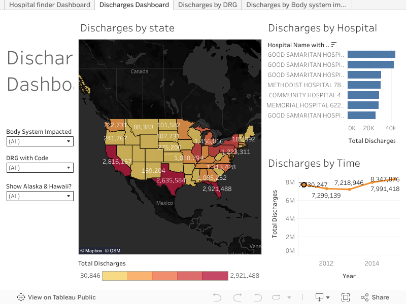
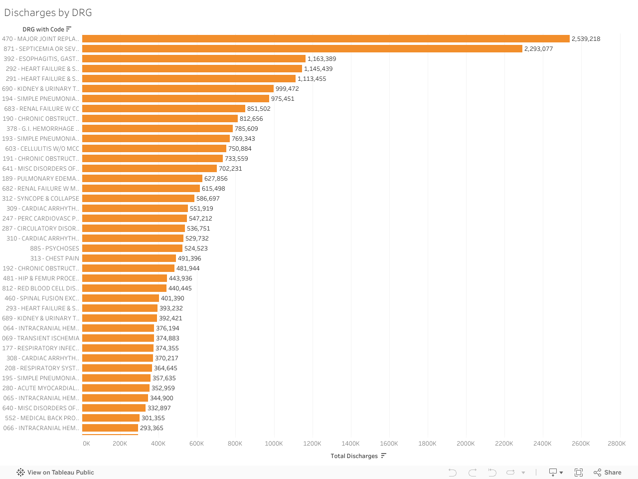

Project Description: Hospital Finder Dashboard for Medicare Data Analysis Using Excel and Tableau
In today’s healthcare landscape, access to data and analytics is essential for making informed
decisions about healthcare spending. The Hospitalfinder Dashboard was designed to provide
insights into hospital quality and costs by analyzing Medicare data. A dashboard is a powerful tool
that helps users explore and compare data related to hospital quality measures, readmission rates,
patient experience, and average costs.
One of the key benefits of the Hospitalfinder Dashboard is its ability to identify high-quality hospitals
that provide care at a lower cost. By analyzing quality metrics alongside cost data, users can identify
hospitals that provide the best value for their healthcare spending. The dashboard includes
interactive visualizations that make it easy to explore different aspects of the data and compare
hospitals based on specific metrics.
The Hospitalfinder Dashboard also includes filters that allow users to focus on specific regions,
hospitals, or metrics of interest. This makes it easy to drill down into the data and find insights that
are relevant to specific areas or hospitals. The dashboard also includes a feature that tracks
changes in quality measures and costs over time, providing a valuable tool for identifying trends and
patterns in hospital performance.
In addition to providing insights into hospital quality and costs, the Hospitalfinder Dashboard can
also help healthcare providers and policymakers make more informed decisions about healthcare
spending. By analyzing data related to readmission rates and patient experience, the dashboard can
identify areas where improvements can be made in the delivery of healthcare services. This can lead
to better outcomes for patients and more efficient use of healthcare resources.